Wednesday, 21 March 2012

Cafe branding :: D&AD :: Image

 Some more photography inspired by trees and woodland environments. 
Interesting how the detailed, delicate logo and type over the detailed photography works?
Personally i would choose a bolder font , but i love the white font over photography!
A consideration for my poster.


Lumen Photography :: D&AD :: Image

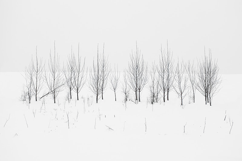
Some amazingly inspiring photography of trees in snow by Lumen.
So simple , two elements , snow and trees , put together make such an appealing image!
The detail in the trees comes out agains the snow , beautiful! 
I love how the colour contrasts and makes the trees look as though they have been stuck onto a white background , they almost look illustrated! 
I like how the trees look out of their own environment , this imagery would look luscious with some nice type over it!


Erik Kessels :: D&AD :: YCN


Paperluxe :: Image

The inspiration for my bookfair is in this entire video!!!          


Flickr in 24 hours :: D&AD :: Image


This installation by Erik Kessels is on show as part of an exhibition at Foam in Amsterdam that looks at the future of photography. It features print-outs of all the images uploaded to Flickr in a 24-hour period…
As you might imagine, this results in a lot of images, that fill the gallery space in an avalanche of photos. “We’re exposed to an overload of images nowadays,” says Kessels. “This glut is in large part the result of image-sharing sites like Flickr, networking sites like Facebook, and picture-based search engines. Their content mingles public and private, with the very personal being openly and un-selfconsciously displayed. By printing all the images uploaded in a 24-hour period, I visualise the feeling of drowning in representations of other peoples’ experiences.”

Sunday, 18 March 2012

Fred Aldous :: YCN :: IMAGE :: Notebooks


In the store there were also notebooks created by young up and coming graphic designers in the area.
The binding of the books were standard and the designs looked very similar to the styles and quality of my peers. i Definitely appreciated the books as they were all so simplistic , trendy and had a hand crafted feel to them. 
Each book was different and had a personality of its own , even the poor print on some of the covers were appealing as it gave each book a U.S.P.
I wish that i had seen these books before my Bookfair brief as these seemed to be selling and for decent prices! , this was due to the sheer simplicity and usage of the book for the audience. 
Lesson learnt , LESS IS MORE! , Producing something that will benefit or interact with the audience will sell, design alone will be appreciated but not sold!




Fred Aldous :: YCN :: Notebooks


The main thing i noticed and liked when seeing these books on the shelf was the futura typeface , which is one of my favourites! When i picked the book up it was very sturdy and the shop assistant mentioned that he uses Field Notes book as they are very Durable. I also like  the plain brown ‘kraft paper’ card cover with rounded corners, it gives the book a natural and simple look. It also has a Handy 5-inch ruler printed along the inside edge of the back cover , an essential for a graphic designer. The pages inside of the book were heavy weight graph paper and smooth to touch, the Grid-lined paper was printed in a light shade of brown for easy legibility. The book seemed flexible and its slim format slips easily into a pocket , perfect for studio briefings , lectures , crits and quick notes or sketches.