Design Context :: OCD

Pages

  • Home
  • DESIGN PRACTICE
  • CRITICAL STUDIES
  • PERSONAL AND PROFESSIONAL
  • WHAT IS GOOD (Research)

Monday, 13 February 2012

Typeface , TOP TEN

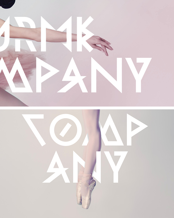
Although it is quite un-readable and i think it is in a foreign language , i like the dynamic shapes within the letters. i am going to use a typeface similar to this in my sequence. 


Posted by LivsBlog at 04:14
Email ThisBlogThis!Share to XShare to FacebookShare to Pinterest
Labels: OUGD202

No comments:

Post a Comment

Newer Post Older Post Home
Subscribe to: Post Comments (Atom)

Projects

  • ▼  2012 (168)
    • ►  December (1)
    • ►  November (29)
    • ►  October (29)
    • ►  May (18)
    • ►  April (16)
    • ►  March (30)
    • ▼  February (19)
      • Bureau Rabensteiner
      • Stats / YCN
      • Distribution of Fedrigoni
      • Samples - Fedrigoni
      • Sectors/ Consumers/ Audience - FEDRIGONI
      • Production of Fedrigoni
      • Modular Folds - Origami / Image
      • JUST INSPIRATION / YCN
      • More work from FIELD
      • 10,000 Digital Paintings from FIELD
      • 10,000 DIGITAL PAINTINGS IN EYE MAGAZINE
      • Ten books , image - Modular Origami Polyhedra / So...
      • Image
      • Research for cd packaging top ten
      • Typeface , TOP TEN
      • TOP TEN
      • Collage themed motion graphics
      • Audio
      • Title Sequences
    • ►  January (26)
  • ►  2011 (158)
    • ►  December (17)
    • ►  November (29)
    • ►  October (23)
    • ►  September (8)
    • ►  May (34)
    • ►  April (12)
    • ►  March (29)
    • ►  February (2)
    • ►  January (4)

Followers

About Me

LivsBlog
View my complete profile
Simple theme. Powered by Blogger.