Sunday, 29 April 2012

Research Concept :: Product, range , Dis


I then startd to consider the range within my proposal of my brief so far. 
As it is photography based , i was struggling to find a product to partner the photographs.
And as my concept is 'Women 'power' i have decided that i am going to propose a campaign to inspire women, and give them confidence. So i have been thinking about collaborating with an existing product such as a skin care product or make-up , using my photography and concept to theme the campaign. 

So i have been researching into existing campaigns for women in the form of websites , products , magazines, books,  photography , events and live performances. 


Friday, 27 April 2012

Women power :: Concepts :: product , range , dis

I am starting to look at potential contexts behind my photography. 
I need to produce deep , contextual stories with using imagery in order to fulfil the brief and so it is appropriate for the 'hunger' magazine article. 
So i have been thinking about 'Woman Power' , looking at various imagery for influences in this subject.

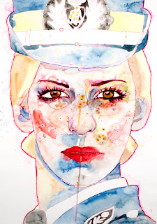
International KUNsT Force

Some mixed media illustrations portraits of women in the forces. 
Although tjhis


Friday, 20 April 2012

MT Making tape

A cute little make of masking tapes that i found in a crafts shop. 


UPLIFT MAG :: IMAGE

An events poster created for Uplift Magazine promoting womans power and rights. 
Love the collage and bold type, the burst of colours is so vibrant and satisfying through the white. 


GUY LARAMEE :: IMAGE

 Guy Laramée is an extremely unique and deep theater writer and director. He also delves in contemporary music composition, musical instrument design and building, singing, video, scenography, sculpture, installation, painting, and literature. He has received more than 30 arts grants His work has been displayed in many countries around the world including The United States, Belgium, France, Germany, Switzerland, Japan, and Latin America.

Below are some mind blowing book sculptures used in one of his recent projects about the Great Wall. 
The time and skills that have been put into these are amazing! 
The concept of this piece of work is in a paragraph at the bottom of this post, and it is pretty hard to understand or re-write. 
But i definitely thought that these amazing sculptures deserved a post in my research for my Image module especially as i have been working with paper a lot.  


Having recently overthrown the American Empire in the 23rd century, the Chinese Empire set out to chronicle the history of the Great Panics during the 21st and 22nd centuries.
This Herculean undertaking resulted in a historiographical masterwork entitled, The Great Wall. Comprising 100 volumes, this encyclopaedia derives its name from The Great Wall of America, a monumental project to build an impregnable wall around the United States of America so as to protect this land from barbarian invasions. 150 years in the making, this wall ultimately isolated Americans from the rest of the world while sapping the country’s remaining cultural and natural resources. It also undermined the American people’s confidence in systematized hedonism, thus hastening the fall of the American Empire. As we now know this paved the way for China to invade American territory.
The Chinese Empire later ordered a group of scribes to write The Great Wall series. In the course of their duties they familiarized themselves with the libraries of the former USA. Through a strange twist of fate they thereby discovered the ancient sources of their own civilization which the new Middle Kingdom had long ago removed from its libraries. In the end this contact, primarily with Taoism and Chan (Zen) Buddhism, sowed the seeds of the Chinese Empire’s demise.


Guy Laramée
Translated by Professor Norman Cornett, historian


Wednesday, 18 April 2012

Web Design :: BIP LING :: Dreamweaver

This is website blog belongs to one of my favourite fashion writers called Bip Ling.
She is pretty crazy and this is certainly reflected in her website. 
Although i stated in my previous post that i like minimalistic and clean cut websites , i love the other extreme of having you're website reflect you're personality and in this case it is the opposite of simple. 

Bip has gone for a tacky colourful style and layout , using childish and random images and icons as links is such a cool idea!
i always enjoy having a browse on this website as i always find something new , there are surprises at every click! 
I like the higgildy piggildy layout as it never fails to keep me amused and revisiting the blog.

The website is all about her and is full of her work, interests and anything she likes , i love this concept as it fully reflects who she is as person. 


The website has the cutest character icon at the bottom which eyes follow you're mouse...


Tuesday, 17 April 2012

Web Design :: Nasty Gal :: Dreamweaver

Nasty Gal is an online fashion store aimed at young quirky females.
I often purchase items from this site and find it a pleasure to use!
Very easy and clear , direct and organised links make it easy to fully brows what they are offering.
The theme of the website is very minimalistic in terms of colour and layout , but this works as the center section of the site is always changing to suit the theme of the season or clothing range.
I love how it is so clean and white with clear black caps text and a big bold black logo , it makes the site sophisticated yet appropriate for a young audience at the same time.


Thursday, 12 April 2012

Research :: YCN


Wax Sealing :: YCN

 Researching more into Wax sealing , some cool visuals in terms of different colours waxes on various stocks.


Wax Sealing :: YCN

After further discussion stated on my design practice blog , we have decided that our notebook and diary need to be partnered together somehow when the consumer receives the product as this would be more appropriate when delivering our product, it will ensure that our product is well considered in terms of professional considerations.

So i have researched into wax sealing, adding an interesting edition to our product as it is a unique method of sealing packaging.
Wax stamping is traditionally used on paper and envelopes , so using this within a product of a paper distributors seems to relate in terms of design.


Packaging and Deliverable :: YCN

 DESIGN PRACTICE ENVELOPE PROPOSAL 

We searched far and wide for black bubble wrap envelopes! Everywhere was wither sold out or were sold in bulk for no less than £40. 
However we did discover that through the website below you can order free samples of the envelopes that are sold in bulk otherwise. 


So we contacted them to see if we could receive a sample of the envelope below and two envelopes came the next morning!!!
Brilliant!


We even received further contact from the envelope company , i will certainly be using them in future projects. 


App :: YCN

                        
To partner our online Picker , we thought why not create an app for Iphones , Ipads , Androids etc (more info on DP posts) 

Here are some existing colour apps , this research was to give us an idea of whats out there in terms of colour picker apps , their layout , how interactive they are , how easy they are to use and how exciting they are visually.
Like the online picker research , i found that the existing apps are simple , do the job and are all quite standard in terms of design. 


This is an opportunity for us to create a visually attractive app for Fedrigoni and to promote their colour swatches to a whole new audience! 
Again the app would be very similar to the design of our online picker and product as a whole. 

Online Colour Picker :: YCN

After further research we have decided that instead of using vectors of the paper shapes as the colour picker , but use the actual paper shapes which i produced for other visuals for our product.

Inspriations came from a site which i found with a similar concept , using paper for digital interactions.
As i have already made the paper shapes and photographed them we have the time to edit our online picker in terms of its visuals.

This concept is such a great idea as we are still using Fedrigonis paper and promoting their swatches , but applying it to digital media.

We yet need to select four paper shapes and edit their colours so that they match the colours that are in Fedrgonis paper sample.


Online Colour Picker :: YCN

Thinking further into our digital side of our product , we realised that creating this picker would be challenging as Fedrigonis Colour range currently showcases 260 colours! 
It would be hard to include all of these swatches into one picker , so we though of breaking the picker down into different sections , and these sections would be based on Fedrigonis four colour swatch books. 
Cool
Neutral Cool
Warm
Neutral Warm


We also figured that we need to design the tool to match the style of our product , so including shapes would be a good idea! 
I have started vectoring digital versions of the paper models which i made and applying colours that match each colour swatch book to the shape. (on DP blog)

Online Colour Picker :: YCN


In a discussion with Kirsty over the phone today , an idea sprung to my mind! As we had been talking about pushing our product further i thought why not go digital? 
Although it is a paper company and the brief requires a printed product ,  having something digitally interactive to partner our product would be great!


I threw an idea our there of having an online colour picker on Fedrigonis website , and we would promote the link to this via our notebook and diary. Therefore we would not only be encouraging people to buy the swatch book but to order the colours using digital media also. 


After researching into this idea , i realised that Fedrigoni does not yet have an online colour picker. 
I also found that existing colour pickers online are pretty much bog standard in terms of visuals! 


Tuesday, 3 April 2012

Post it notes :: YCN

I found these post it notes inspired by the classic arcade game 'Tetris'.
The notes come in a pack including different shapes and colours of sticky notes blocks.
I found the notes on Suck.UK and fell in love with them!
I love the way that Suck have made such a simple piece of stationery interactive and attractive! 
the notes can be used as art work itself , and at the same time be useful and essential for note making and reminders!


They look even better when written on in a thick black pen!

And ever more better when stuck down! This looks just like a personalised game of tetris.