Wednesday 21 March 2012

Cafe branding :: D&AD :: Image

 Some more photography inspired by trees and woodland environments. 
Interesting how the detailed, delicate logo and type over the detailed photography works?
Personally i would choose a bolder font , but i love the white font over photography!
A consideration for my poster.


Lumen Photography :: D&AD :: Image

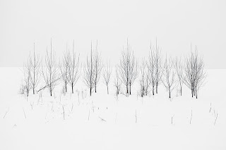
Some amazingly inspiring photography of trees in snow by Lumen.
So simple , two elements , snow and trees , put together make such an appealing image!
The detail in the trees comes out agains the snow , beautiful! 
I love how the colour contrasts and makes the trees look as though they have been stuck onto a white background , they almost look illustrated! 
I like how the trees look out of their own environment , this imagery would look luscious with some nice type over it!


Erik Kessels :: D&AD :: YCN


Paperluxe :: Image

The inspiration for my bookfair is in this entire video!!!          


Flickr in 24 hours :: D&AD :: Image


This installation by Erik Kessels is on show as part of an exhibition at Foam in Amsterdam that looks at the future of photography. It features print-outs of all the images uploaded to Flickr in a 24-hour period…
As you might imagine, this results in a lot of images, that fill the gallery space in an avalanche of photos. “We’re exposed to an overload of images nowadays,” says Kessels. “This glut is in large part the result of image-sharing sites like Flickr, networking sites like Facebook, and picture-based search engines. Their content mingles public and private, with the very personal being openly and un-selfconsciously displayed. By printing all the images uploaded in a 24-hour period, I visualise the feeling of drowning in representations of other peoples’ experiences.”

Sunday 18 March 2012

Fred Aldous :: YCN :: IMAGE :: Notebooks


In the store there were also notebooks created by young up and coming graphic designers in the area.
The binding of the books were standard and the designs looked very similar to the styles and quality of my peers. i Definitely appreciated the books as they were all so simplistic , trendy and had a hand crafted feel to them. 
Each book was different and had a personality of its own , even the poor print on some of the covers were appealing as it gave each book a U.S.P.
I wish that i had seen these books before my Bookfair brief as these seemed to be selling and for decent prices! , this was due to the sheer simplicity and usage of the book for the audience. 
Lesson learnt , LESS IS MORE! , Producing something that will benefit or interact with the audience will sell, design alone will be appreciated but not sold!


Fred Aldous :: YCN :: Notebooks


The main thing i noticed and liked when seeing these books on the shelf was the futura typeface , which is one of my favourites! When i picked the book up it was very sturdy and the shop assistant mentioned that he uses Field Notes book as they are very Durable. I also like  the plain brown ‘kraft paper’ card cover with rounded corners, it gives the book a natural and simple look. It also has a Handy 5-inch ruler printed along the inside edge of the back cover , an essential for a graphic designer. The pages inside of the book were heavy weight graph paper and smooth to touch, the Grid-lined paper was printed in a light shade of brown for easy legibility. The book seemed flexible and its slim format slips easily into a pocket , perfect for studio briefings , lectures , crits and quick notes or sketches.


Fred Aldous :: YCN :: Notebooks


These amazing new 2012 diaries designed by Marks Tokyo Edge was one of my favourites in the store , Made of silicone, and at an A6 size it's perfect to pop in your'e bad when on the move. The Notebook is inspired by lego and colour , i like how they have used specific materials to suit the notebooks context, a playful texture 'silicon' and colour to represent a toy 'lego' .
The notebook is easy to clean since is spraied with silicone oil on the surface 'noted on the packaging'
The book also comes with two detachable tapes, that also can used for the decoration so that it is interactive, something that we have been struggling to achieve when producing our notebook. 


Fred Aldous :: YCN :: Notebooks


The first set of notebooks in the store were the pantone edition moleskin books , the colours just drew me in!
If you appreciate paper, they will sure appreciate them in all senses, they came in several colours, my favourite out of them all was this cute Process Yellow edition with a pink elastic band. 

The combination of Moleskins quality binding and socks and pantone colours created the ultimate notebook for a graphic designer! 


Wednesday 14 March 2012

Notebooks :: YCN


This combination of craft supplies and note book that is also a portable product is such a clever concept!This notebook by 'your secret admiral' is unique and graphic , again perfect for our target audience.
It is interactive as it can be used as a measurement tool and a notebook. 
It seems sturdy and a well bound book! plus it look as though it has a range of quality papers within the notebook itself including what looks like graphic paper , handwriting paper , brown paper , kraft paper and simple lines papers, this relates to our product as we are promoting Fedrigonis new colour stock range.

It seems to work well as a sample book as well as a scrap or note book which is great because this appeals to any type of designer! 
Another thing that i like about this particular book is its rounded edges! We definitely need to purchase some kind of tool so that we cane create this effect when making our notebook!


Also minimalistic print on grey card looks fresh and gives it that graphic edge on an arts and craft product ...


Notebooks :: YCN


Pantone design

Jane showed me her red pantone notebook that she kept with her at all times, i loved the simple design inspired by the actual pantone swatches themselves. 
I like the combination between info graphics and visuals within the product , it is interactive! 
These books are perfect for our audience as the use of pantone colours are essential to a graphic designer like myself. 
Each book is an exact colour match to the pantone number it has displayed on the cover of the notebook.
As we are looking to promote Fedrigonis new colour range this is a good concept to think about in terms of pushing the idea of creating a notebook and diary further. It also expresses the obsessive and precise work ethic of our audience 'graphic designers'.


Tuesday 13 March 2012

Paper Distributors :: YCN

Who Were competing against..
From our research we found some of the existing paper distributors which our peers and graphic designers in our area use regularly when purchasing various stocks.
Here are some

DINSDALES


SEAWHITE


LONDON GRAPHIC CENTRE


STAPLES


PAPERCHASE


DALER & ROWNEY


THE WORKS


Paper Distributors :: YCN


I have discovered this paper distributors through our stats in our question air and they were also mentioned by jane in our discussion today , i havent heard of them before but i will definitely be giving them a visit in the future. 
It will be good in terms of research into competition , look at stocks and for our benefits in our own practice.


YCN

INSPIRATIONS 


Looking into our idea of having a set of personal stationary perfect for a graphic designer.


During our talk with jane , we were talking about what a graphic designer wants and needs from a notebook or diary and the evidence was right in front of us , her notebook and diary. 
She mentioned that without these she would be lost and the notebook and diary were the base of her practice and  life in general!


In terms of research and evidence this was perfect! 


We began to talk about notebooks and what they are useful for.
Kirsty , jane and I found that we could relate to each other a lot about our personal notebooks and diarys and found ourselves getting carried away in conversation.
Little things like 
Reminder stickers/post it notes
Circled dates
Folded pages
Ripped Pages
Highlighted notes
Bookmarks 
etc


So we have also proposed to include these little additions into our diary ensuring that our product ticks all boxes , literally! 
Making our diary a little more interactive,we also want to pick out important dates a graphic designer may want to/need to be aware of (for example D&AD deadline, creative awards etc.) this will create greater emphasis to the fact that Fedrigoni are not just paper suppliers but paper suppliers that will meet the needs of a graphic designer.


To further our research i am going to look into personal diarys and gather styles , sizes , stocks and content of the typical graphic designers notepad. 

FILE FX :: YCN


To extend our audience and generate contacts and potential clients we have proposed to compose a focused mailing list which will target creative directors who have clients who deal with print based media; this will then ensure that we are targeting the correct people so that Fedrigoni are not wasting their money on distributing these packs to people who are not going to respond or even want to purchase paper from Fedrigoni. To do this we are going to propose using File Fx to purchase a specified mailing list.
Jane mentioned that it would be around £150 for a sufficient mailing list appropriate for our product and promotion. 

Monday 12 March 2012

What were promoting :: YCN


Fedrigoni Imaginative Colours paper selector, an encyclopedia of colour available from the entire Fedrigoni special papers range.

The tool consists of four fan style paper booklets, divided into sections of: warm, cool and neutral colours, containing a total of 262 samples of paper. The Fedrigoni paper selector is an essential tool for graphic designers to appraise the best shade and suitable surface for their latest projects.

The ultimate toolkit for design and print professionals, who'll soon be wondering how they ever managed without it on their desks, a real source of inspiration for loads of creative, innovative ideas!
You can purchase one of these swatches only from the Fedrigoni online shop

 www.fedrigonicartiere.com/Xerography/products.asp?Promozioni=IMAGINATIVE_COLOURS&LID=E